Websites that make sense at first glance.

Websites and online stores designed and built by NYVINA, so visitors understand your offer, find their way and take the next step.

When visitors have to guess, they leave.

Every offer competes for attention, and the next step is hard to find. Few visitors complain. Most simply go elsewhere.

  • Where do I start?
  • Which one is for me?
  • How do I order?
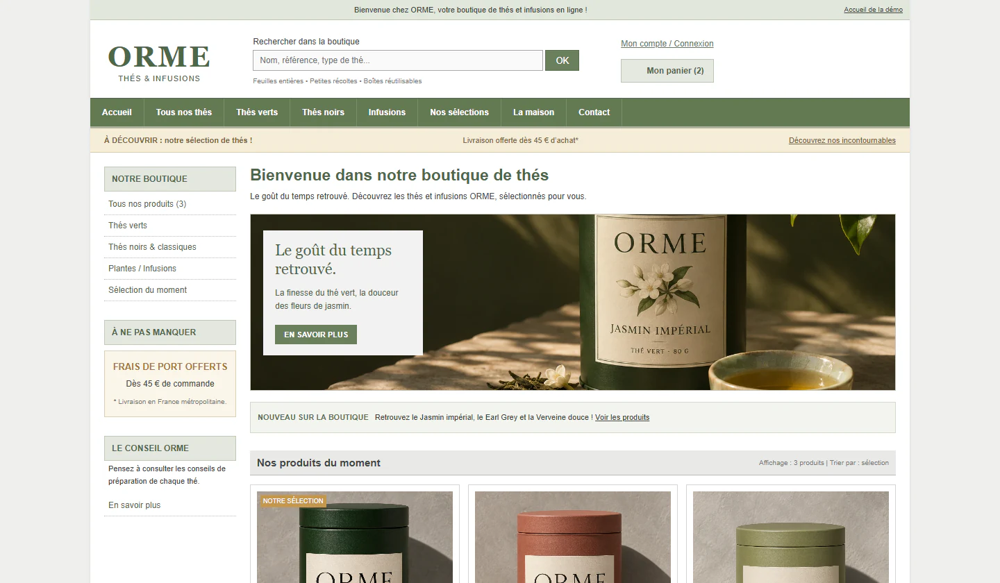
Before: the home page of a fictional tea shop on a computer. A green bar of eight menu links, a search box, two promotional strips, a sidebar of categories and a small welcome banner compete for attention.
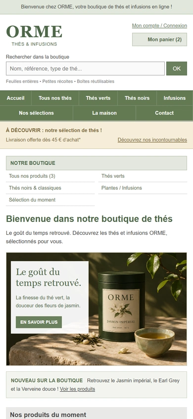
Before, on a phone: the same home page, with its menu wrapped onto two rows and the categories stacked above the welcome message.
Before · Illustrative concept · fictional brand

The same shop, redesigned.

A better website does more than look beautiful. It helps people understand, find their way and act.

Page to compare
Before: the tea shop’s home page, with eight menu links, promotional strips, a sidebar of categories and a small welcome banner.
Before
After: the redesigned home page, with three menu links, one headline, one button and a large photograph of a tea tin.
After
Before: the product page of a green tea, with the price, the options and the purchase steps in separate boxes.
Before
After: the redesigned product page, with a large photograph, and the price, format, quantity and add-to-cart button grouped together.
After
Before: the cart, with a four-step progress bar, a promotional code field, a confirmation checkbox and a button that leads to sign-in.
Before
After: the redesigned cart, with the delivery cost, the total and a single button to continue, and a note that no account is needed.
After

Illustrative concept · fictional brandORME is a fictional brand, created for this demonstration. It is not a client project.

Understand, choose, order.

The redesigned visit, on a phone.
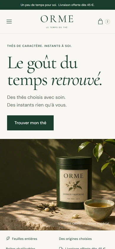
  1. After, on a phone: the home page opens with the headline, two short lines and a single button, above a photograph.

    Understand

    What the shop offers, and where to begin, at first glance.
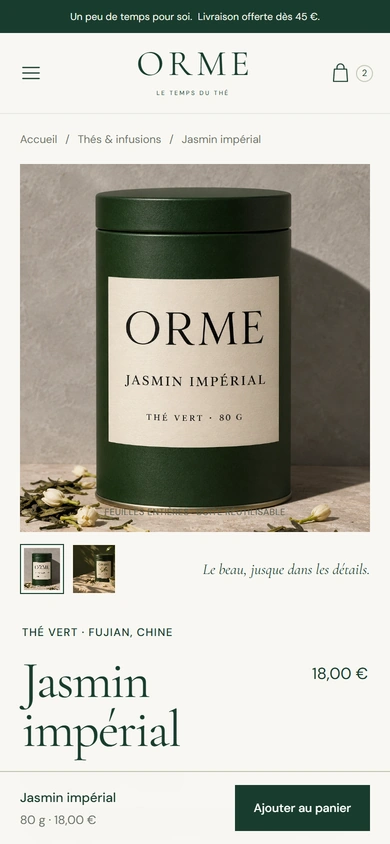
  2. After, on a phone: the product page shows the tea tin large, its name and price, with an add-to-cart bar fixed at the foot of the screen.

    Choose

    The product, its price and the button, always within reach.
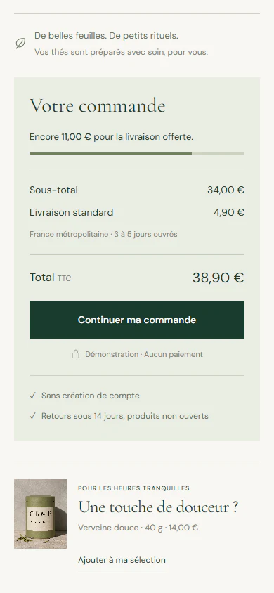
  3. After, on a phone: the order summary lists the subtotal, the delivery cost and the total above one button, with a note that no account is needed.

    Order

    Delivery and total shown before checkout, with no account to create.

After · Illustrative concept · fictional brand

What we build

Showcase and premium websites, online stores, launch pages, and the custom features they need.

Tell us what your website should change.

A few sentences about your business and your visitors are enough to start.

Discuss your website project